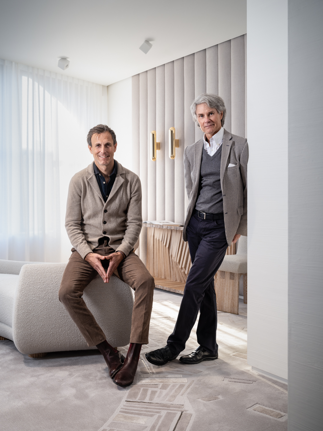
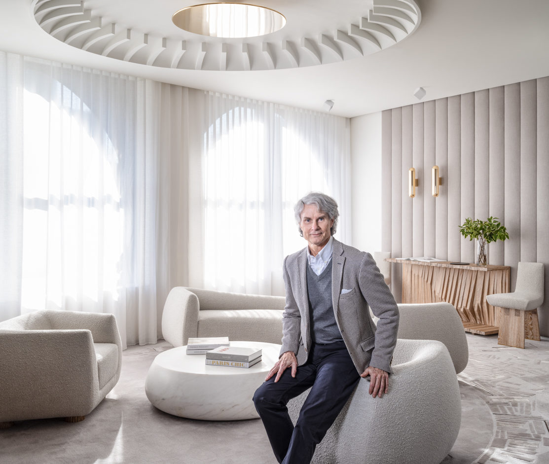
In 2019 we asked the esteemed American designer Thomas Pheasant to design our new showroom. We gave him no parameters as a client and the only stipulation was to use all of our artisans and their talents to highlight their incredible savoir-faire. He delivered beyond our expectations. He transformed our classic downtown New York City loft-style apartment into an extraordinary space – a beautiful and serene environment that showcases what our French craftsmen can create through the lens of an American designer. We were thrilled to sit down with him in our new showroom and hear about his design process from visiting the workshops in France to having an “aha” moment when he saw a piece of metal and to learn what inspired him as an eight-year-old child that led him on the path to design.
Today is the first time seeing the new showroom that you designed. What was your reaction when you first walked into the space?
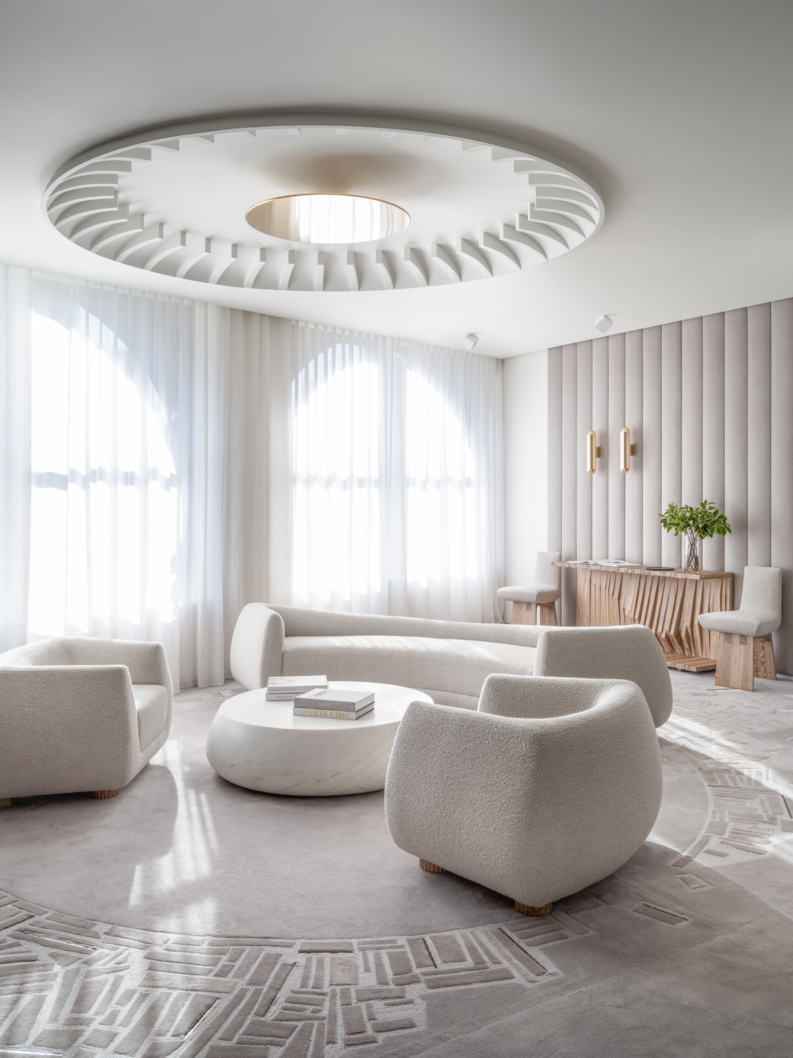
It was wonderful! The feeling that I wanted to express in my design was the idea of a cloud, an escape from the city outside, so I feel like I accomplished my aesthetic goal. I think that the whole feeling of the transition that the apartment went through is pretty dramatic. It is great to see all of the different separate elements come together to create one concept, and that was part of my goal. This is used as a showroom but a lot of showrooms you go to are a collection of various designs from different artisans or workrooms that are totally independent of a single idea. So, it is like going to a grocery store and you are picking from different elements. I wanted to bring all of these artisans together so that it would be similar to a residential experience where they are working on a vocabulary that is unified through one designer. One can see not only the quality of work by each artisan but how a designer or architect can achieve their artistic goal through the collaborative talents offered at Par Excellence. So that someone coming into the space for the first time experiences more than a variety of samples, but an actual creative collaboration.
What was your starting point for your design?
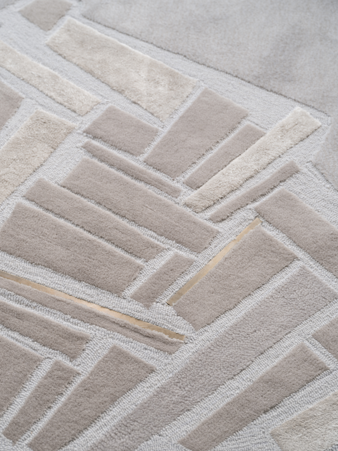
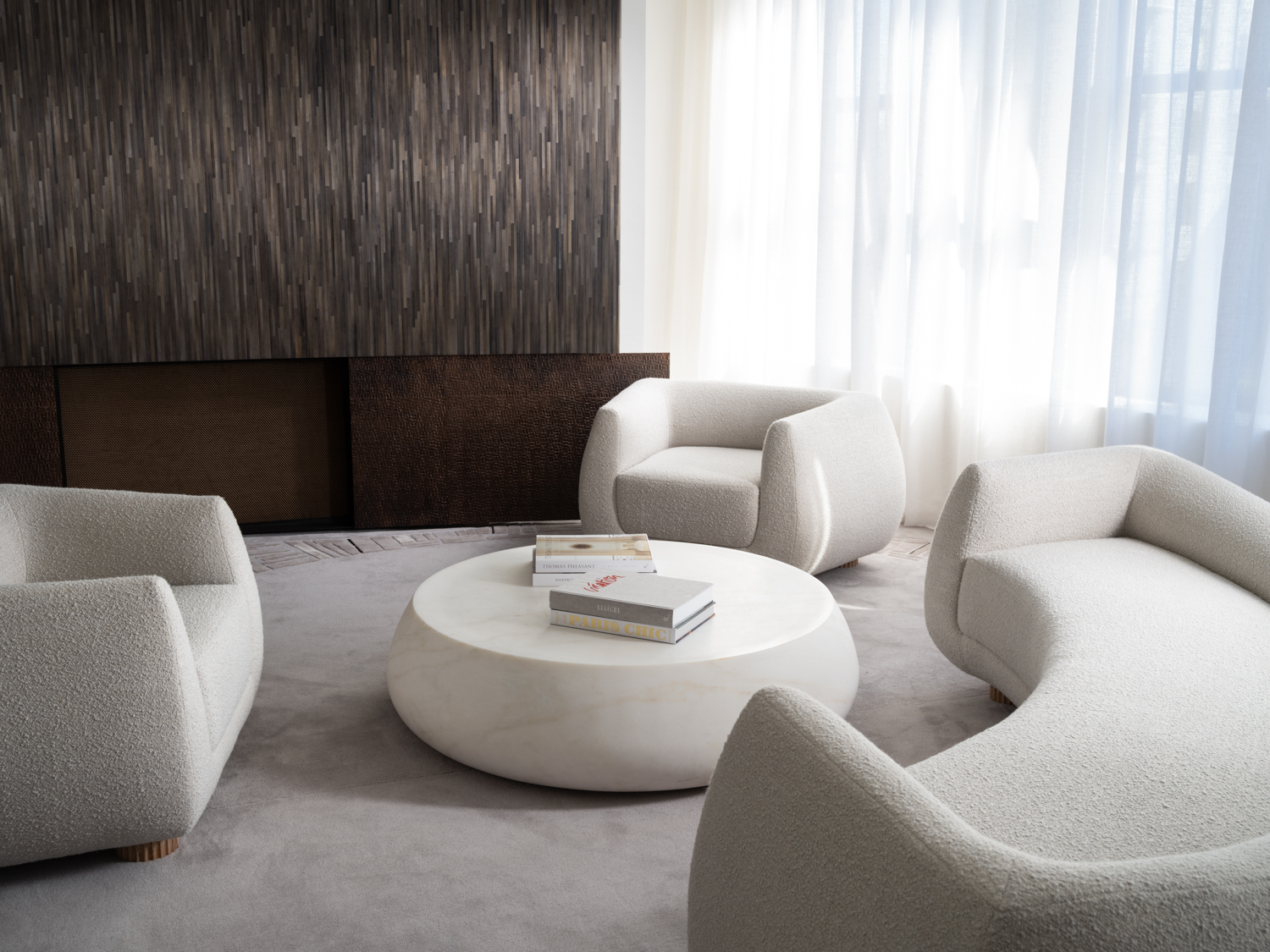
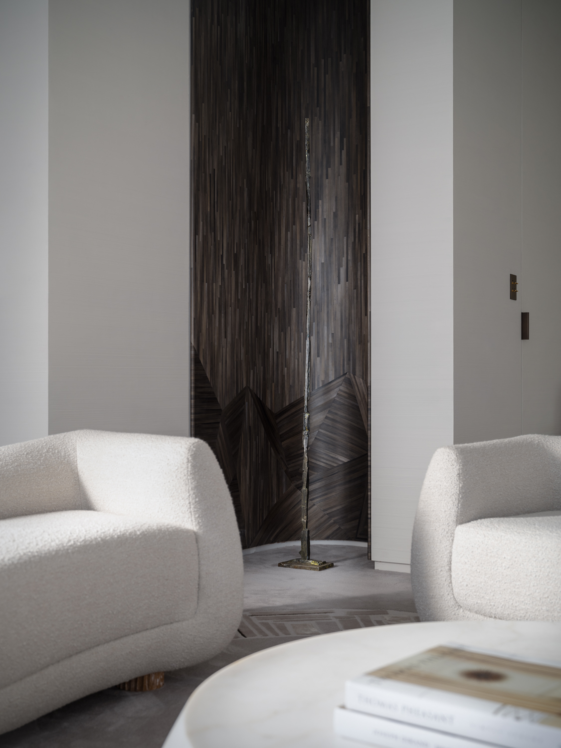
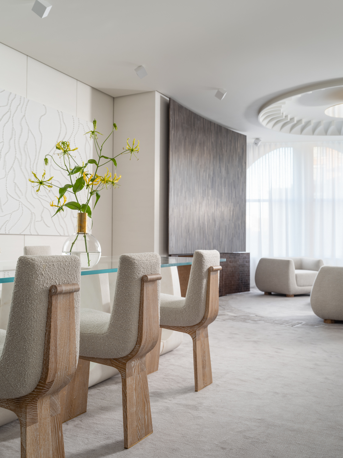
The actual starting point was the floor plan which was led by the rug design. I wanted to bring a circular motion into this rectangular space to eliminate the feeling of a box. The circular frames of the windows are a very nice architectural element in the space and I wanted to connect to them. The rug design led me to create the dome for the ceiling which reinforces this circular momentum between the two planes. The curves of the sofa echo the design of the carpet as well as the outside curve of the dining chairs and the curve of the niche.
How did you become involved in this project?
The project started when Guillaume (the CEO of Par Excellence) reached out to me upon the suggestion from Romain Jouffre as I had been working with Jouffre for some time. I went to visit the artisans at their various workshops around France and it was great to see what they do. In my studio work in Washington D.C., more and more we are seeking workshops to learn what they do and then create, as opposed to creating something and then desperately trying to find someone who can fabricate it. By visiting an artisan’s studio and seeing their skills being performed, I think it is a better way to spark creativity. For me it is a learning experience and a luxury to get out from behind my own desk and truly collaborate.
Seeing the artisans at work is a great way to understand their savoir-faire. The artisans can create whatever you dream of as they have the skills. You bring the ideas and they can execute.
Yes, for example, when you go to the workshops at Ateliers Saint-Jacques you see artisans working in stone, metal, bronze and wood. The workrooms are multiple and large, you can easily spend a full day there.
You have worked with Jouffre before. Did you have any great new discoveries working with our other artisans?
Yes, I have had Jouffre create unique pieces for a few of my projects including my own home. Regarding great discoveries, the carpet design is a perfect example of implementing new ideas. After just my first meeting with Manufacture de Tapis de Bourgogne at their workshop and talking with them about the designs for the carpet and what they can do, we discussed the addition of bronze elements into my design. They were totally open and interested in working with me on creating something special. The metal elements crafted by Ateliers Saint-Jacques inspired the name of the carpet design, “Ingot”. It would not have occurred to me to use metal in my carpet but here we are! It was in my mind that I was going to have bronze elements in the space as I often connect materials throughout my interiors. Carrying through – not just color, but texture or patterns or shapes like the silhouettes of the sofa and cocktail table. People ask me what do you think makes a serene interior, what makes a special interior? If it is hard to find the words, that is a very good thing. Often, it is in the things you don’t immediately notice. You can come in here and say, “I love the sofa, I love this, or I love that”, but what is it about the dialogue between everything that makes a room come together in a special way that is instantly recognizable. My interiors are subtle in a way, but I think for a successful room it takes a long time to discover everything the room has to offer. That is
important to me. Simplicity is not simple.
It is serene but full of so many details. With the carpet – did you have an aha moment – let’s combine metal with the pattern?
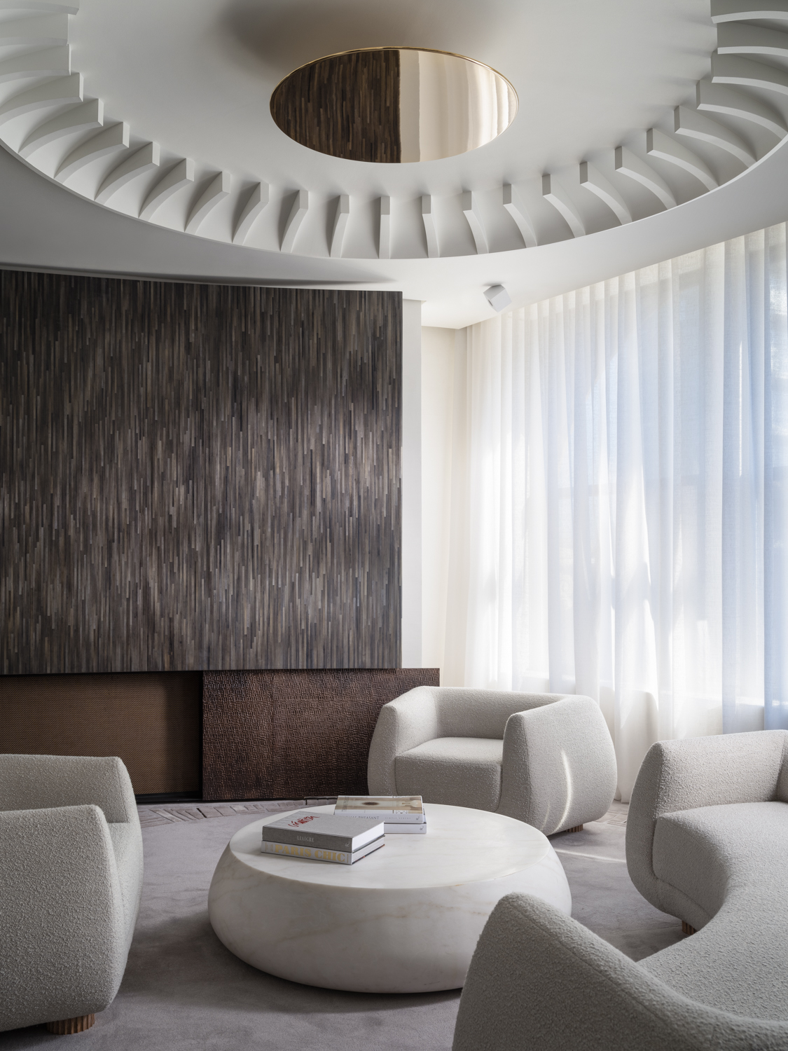
I knew the pattern I wanted and the metal idea came about after visiting Ateliers Saint-Jacques and seeing what their metalworkers could create. This also led to the bronze metal screen details on the fireplace. Then there was my collaboration with Atelier de Ricou. What I wanted them to do with the wall panels is so subtle. They can do anything, and their portfolio is so unbelievable. The wall panels have such a subtle texture but for me it is so beautifully executed. A lot of people can make me a sample but to carry out the panels in the way they have is so refined and is not easy. The wall texture is not an obvious show piece like the ceiling feature when you walk in and say, “oh my gosh”, but it is the quiet elegant support of the whole idea behind the interior. You want to give your eye the opportunity to wander and discover.
This subtle combing technique and texture is beautiful. How did you come up with this idea?
Pierre Soulages is an artist I love. I had seen an exhibition of his artwork in black at the Louvre and I took many photographs as I loved the texture he creates in his work. I sent Atelier de Ricou a photo with the texture and said this is what I want to achieve on the walls, and they were able to interpret his technique into wall panels.
That is what I like about Atelier de Ricou because you think it is one thing and it is something else. Like a trompe l’oeil effect. Can you please tell me about the interesting design of the console table?
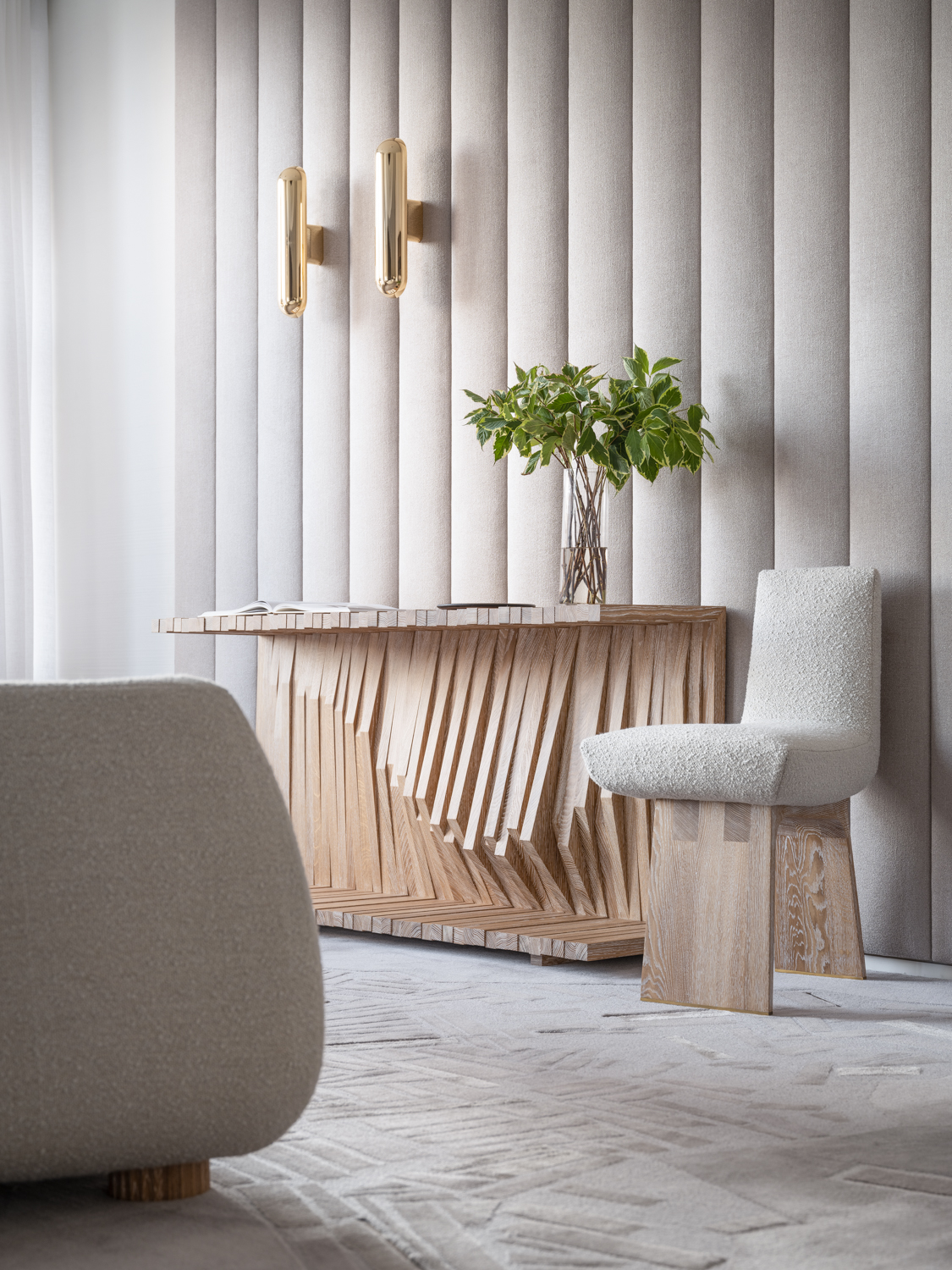
It was crafted by Ateliers Saint-Jacques and it is made of cerused oak. My original intent for the console was to do it in bronze but it segued into wood which I think looks great. I liked its contrast to the softness of the walls plus it ties in with the finish on the dining chairs. For the design, I was playing with ideas, and I ended up with this wave of wood strips that create a movement. I went to Japan right before the pandemic and it was very influential for me. It wasn’t at all a conscious thing but as I stare at my work now, I am a collective of everything I have seen and been inspired by so maybe there is a bit of a Japanese influence coming out in this design.
Can you please tell us about the padded wall panels made by Jouffre and sconces made by Ozone that are behind the console?
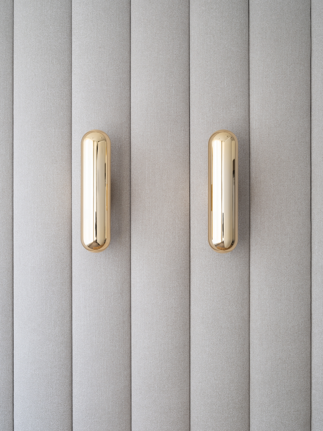
I wanted to bring in some contrasts in color and texture as I didn’t want the whole room to be white. I had the wide white textured panels and I wanted something that would break up the wall elevations and soften the space. I knew that I wanted to use those sconces (the Gélule Wall Lamp by Ozone). The padded fabric panels are almost echoing the feel of the sconces – this sort of rounded vertical tube. For the sconces, which would typically be spaced apart on each side of the console, I wanted them to be seen as illuminated wall sculptures. I placed them together and off center to elevate their sculptural quality.
The dome ceiling is really a showstopper along with the sofa, coffee table and chairs. Can you please tell us about your thought process on designing these?
The dome ceiling is incredible. Here is another wonderful example of how I brought together two of Par Excellence’s artisans to create such an exceptional piece. The plaster dome was crafted by Auberlet et Laurent. Ozone made the bronze plate and the lighting elements. This highly reflective brass gold tone of the bronze plate is meant to carry the material from the sconces over to the sitting area. The coffee table is very heavy but it is just so pure. The shape that was on my mind when I was doing the upholstered pieces echo this shape. The subtleness of the gentle curve to the top edge is amazing. To me it is almost like water that is trapped like a pond on the edge of a pool of water. You want to touch it.
The shape of the sofa is so unique.
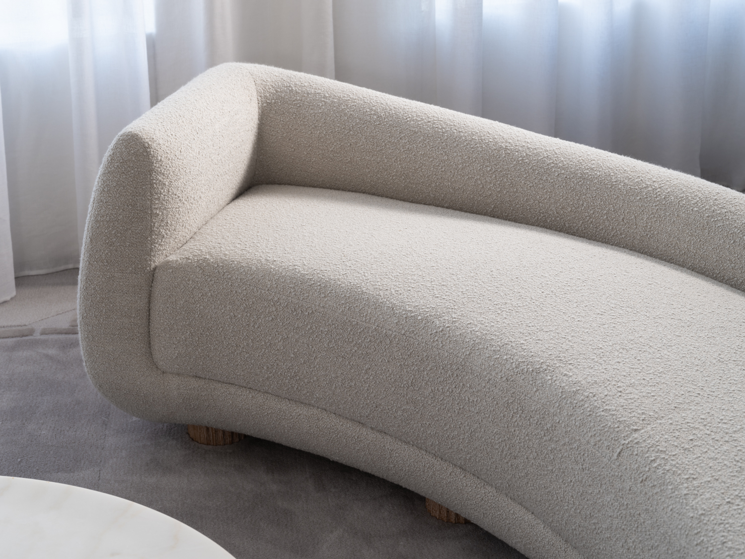
The sofa was created just for this space. Everything in here is trying to break the rectangular use of the room where one would normally put the sofa in front of the window with chairs on either side and a rectangular table. It is freeing. Taking advantage of space even though it is not enormous you can create a lot of air by floating pieces. Even though it is a long sofa by cutting away the mass in the back of the sofa you are allowing the air to circulate more freely and the view of the room opens up. The large sofa is similar in scale to the ceiling dome. These ceilings are not high, so it goes against the logic that if a ceiling is low one does not want to have something big. Large is not an enemy of small spaces, it’s how you manipulate the mass that matters.
Is this your first time working with straw marquetry?
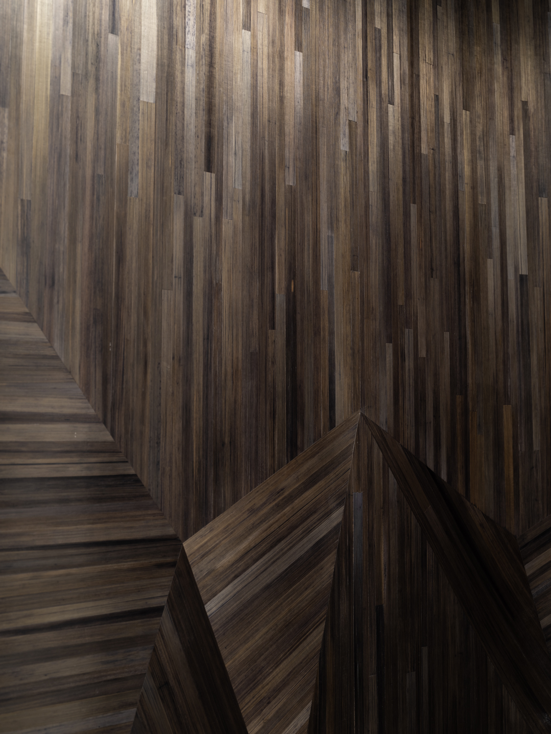
Yes! Again, it is a workshop where they do everything. You go there and see the colors and what Lison de Caunes has made in furniture, wall panels, and screens. The straw marquetry in this showroom space is subtle compared to all the amazing work they create, but the work is perfect. She does so many beautiful things with patterns as you can see with what she did with the niche. Again, it is taking an artisan who can do almost anything and to present their know-how in my voice. This is part of the message behind the design of the showroom as they offer so much to all forms of design. A traditionalist can benefit from working with them. Somebody who is over the top with color can work with them. This is my voice using these great artisans. I am the conductor, and they are the orchestra, and this is my music. I will absolutely use straw marquetry again. Like what I did with it in the showroom, they are not limited to furniture but for creating architectural and sculptural moments in a space.
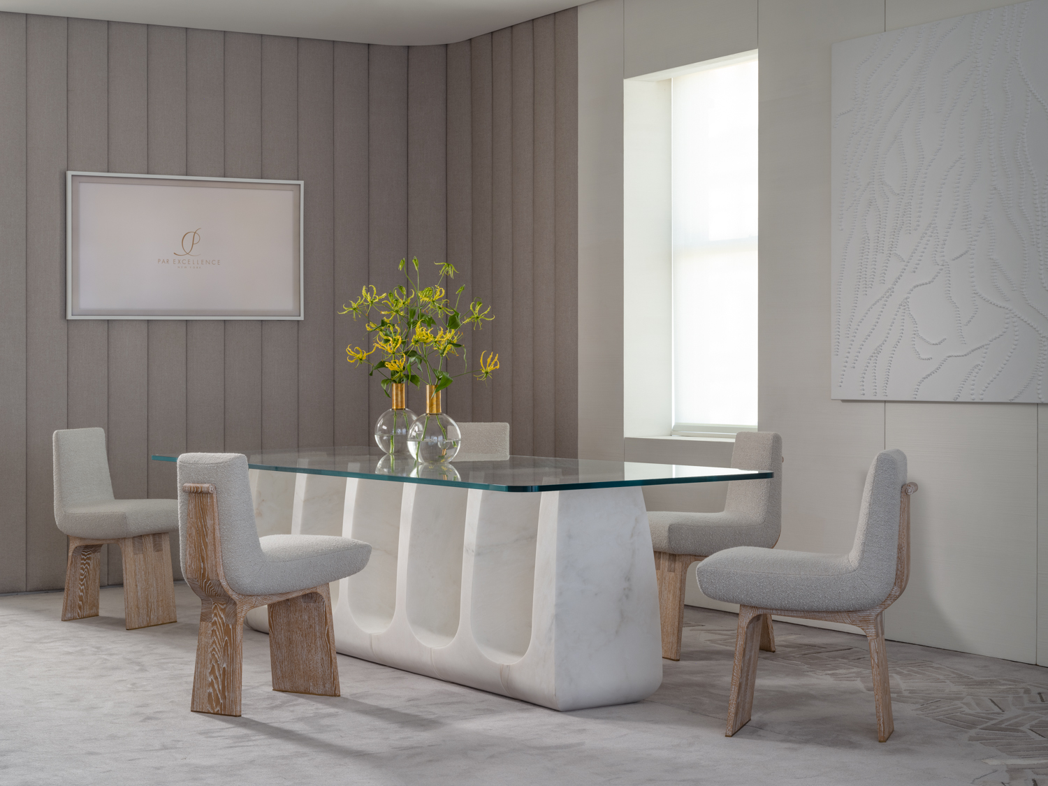
Souchet Woodwork Seats made the dining chairs. They are beautiful and feel like sculpture and not what you would normally think of for a dining chair.
I wanted a curvaceous shape that echoed the forms of the sofa and tables. I was playing with the form and wanted to take advantage of what Souchet has to offer. The wood base of the chairs not only relates to the cerused oak of the console but the form adds a sculptural quality that can be found in every piece in the showroom. I think they are beautiful and the upholstered seat by Jouffre adds the perfect combination of form and comfort.
Sometimes the dining chairs get overlooked but here you almost see the chairs before you see the table.
Actually, it is the back of the dining chair that can matter most as that is what you typically see first. That is why so much attention was paid to the scroll detail along the back. These are
definitely chairs you want your guests to see.
What does French craftsmanship mean to you and why is it important?
It is the tradition, the heritage, the legacy and the generations and centuries of developing the craft. There is so much to know. I really believe that the more you understand the past the better you can present the future. I think there are so many things that you can learn by observing. By going to these ateliers and watching and seeing what they can do. I tell design students that textbooks are great and the internet is great, but you have to physically go out and experience architecture and design. To physically experience things. I think there is something about the beauty of an experience that resonates and lingers. It shapes your learning process. Many people can recognize ugly. But the same is true with beauty. You may not be able to draw it yourself or you may not be able to build it yourself, but I think there is a recognition that people have for appreciating beautiful design. I have a great story about my father. I took my parents to Paris in 2004. I just wanted them to see what I was experiencing in my travels. We went to Versailles. My father is not a good traveler. So, I was afraid that this tour would be too long for him. When I got to the end of the tour and I didn’t see him so I thought he had left. I went back through the museum and I found him mid-way. He was in a room all by himself staring at the paintings and at the details. He was in his own world. I just observed him as he was observing. It was so beautiful as here is someone who I didn’t think would connect but he totally connected to the beauty of it. We all do it at different levels. The more experienced we are the more aware we are and you look deeper into what you are
viewing. I think the same thing is true about learning from artisans and finding new voices to help you express yourself artistically. That is part of my attraction to Par Excellence, to be able to push my own creative envelope through the experience of artisans who have been working in their crafts for many, many years. I am sure the reverse is true for the artisans. If you go to Ateliers Saint-Jacques these are craftsmen who are doing restorations at Versailles. They have more than mastered those crafts and the ability to reproduce tradition authentically. But I think challenging the same people to do something with the same materials but in a modern vocabulary I think that is an exciting challenge for both the designer and the creator.
Was there a key moment when you decided to follow your passion for design?
I started my college education in architecture and loved it, and still do. There was a professor who I was working with in my second year who I had presented a project to, and he told me, “Tom, you are the only one who brought me inside and then took me back out and it was all in one unified voice. We have an incredible interiors department and I think you might want to take some classes as you are obviously connecting the interior and exterior”. So, I did that and it didn’t take long for me to realize that this new venue was very right for me. Architecture is at the soul of everything that I do whether it is furniture design or creating the spaces that I work in. So, it was a fortunate moment for me that a professor saw me as an individual and gave me some guidance that turned my head a little bit and put me in the right direction. But farther back then that – it wasn’t a realization of what I wanted to do but it was my first connection. I was in 3 rd grade and went to The National Gallery of Art on a field trip with my class. We were standing in the rotunda in a single file line waiting for the tour guides to come and take our group through the galleries. We were waiting in the rotunda and I was looking up at this incredible building designed by John Russell Pope which at the time was his perspective on the evolution of classical design. Interestingly, it was also designed in an era when modern architecture was at full thrust and reproducing classical ideals wasn’t really considered relevant. As an 8-year-old standing in the rotunda I remember being amazed by this space and that I had never seen anything like it. I remember going home to tell my parents about this amazing building, and stating, “I wish we could live there!” At the time I didn’t realize all that I had taken in but as an adult and being able to remember that moment I realize again it speaks to that human connection to something that is beautiful. I had no experience in this kind of architecture but on a human level it really grabbed me. It created a foundation for me that would continue throughout my life.
Several years ago, you won a John Russell Pope award from The Institute of Classical Architecture & Art. It seems like you have come full circle after hearing this story about the rotunda.
Yes! Also full circle, when I did my book, Simply Serene, I asked one of my clients to write the introduction because she was the Chairman of The National Gallery of Art and her offices were in the building that I experienced as a child. I thought, oh how beautiful that my opening story talking about this experience and then this client who I had done a number of projects for and who knew my process and knew me very well could give her take on Thomas Pheasant. You almost can’t plan that. It is really a beautiful connection. Sometimes I do think I am on a distinct path as I have had so much good fortune.
Are there any contemporary designers that you admire?
There are a lot of contemporary designers that I respect from all over the world but not necessarily the designers who do the style of work that I do. I am more interested in the spaces that are outside of my box, outside of what I do. There is a lot to be learned. And you can get inspiration from so many people and places. I am also inspired by French modern designers from the 1940’s and 50’s and what they were doing and their streamlined view of modern design. Being brought up in Washington, D.C., a city that is full of classical architecture and design, I try to reimagine classicism in new ways. I try to do that through my own personal lens.
I heard that you are a big Francophile. What are your favorite things about Paris?
Oh yes! When I am in Paris, I just walk and wander a lot. Because in my studio in the United States we are constantly working and we are in our studios or we are traveling for projects, it is a pretty intense scheduled lifestyle. The beauty of my time in Paris, and one of the reasons I go, is because the clock stops the moment I arrive and I sleep longer, which is great. I have the opportunity to be an observer and to walk and to visit galleries and to think. It is a luxury that we don’t realize in the States, how little real quality time we give ourselves to digest our thoughts.
How do you stay creative as you have had your career for such a long time?
You have to nurture yourself because nobody else will. The interior design industry is a business no matter what aspect you are in. The production of interiors and furniture and the business of it is 80%, if you are lucky, you have 20% where you find yourself in the creative part of it. You have to get out of your studio and experience life outside of your corner. And that feeds me. And it makes you better. And you need to be curious. You have to find your inspiration out there. It is not on Netflix.
Was there a recent trip that resonated with you?
Japan! I went there for the first time right before the pandemic. That was so different from my European travels. I do a lot of European travel and I am so comfortable in Europe and familiar with it and still inspired by it, but Japan was a very different experience because it was a place where I was totally an outsider. I was the observer throughout the whole time I was there. It is also interesting that it is one of the few places where the culture has remained intact and so strong. You see it in every aspect of life from the most traditional to the most modern. It was very overwhelming in a very beautiful way. You can’t speak or understand the language, but you connect to something beautiful. It was a fantastic experience.
The sun was starting to set as we finished our conversation. The door to the rest of the apartment was closed, the sheer curtains were drawn, and classical music was softly wafting through the space. The showroom had such an ethereal quality. Thomas’s thoughtfully planned space was beautifully detailed giving it a feeling of a luxurious sanctuary. One can easily forget that the hustle and bustle of NYC is right outside the door.
Photo credit : Joe Kramm
